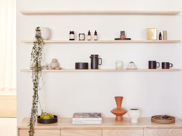
Designed to feel more like a home than a retail store, our curated approach to shelf styling reflects our appreciation for minimalism and refined detail. Recreate our signature relaxed aesthetic at home with our step-by-step guide.

Clean slate
Start with empty shelves to clearly see the space you are working with.
What items and objects are you working with? Are there any consistencies? Any contrasts? Do they tell a story?
Create a grid system
A grid system will do two things for the overall look of the composition. Firstly, it will help create a subtle sense of uniformity and consistency, especially in compositions made of many disparate elements. It will also innately allow for negative space between the objects which will give the shelves a polished and refined look.
The shelves themselves act as the horizontal grid lines. To create the vertical grid lines, divide your shelves up evenly into sections. When placing objects, only place within the grid, and leave space where the invisible grid lines are.
Balance and Asymmetry
When placing objects within the grid, think about balance and asymmetry. Compositions look best when they are either intentionally balanced or intentionally asymmetrical. Play with elements such a size, shape, colour, and texture to see if an asymmetrical or balanced composition works best for your space.
Styling isn’t static
Your shelves can change and evolve as much as you change your clothes. Don’t feel like you are locked into a particular look or composition. Have fun playing around and creating different looks for your space.
Tips
Colour
Use fruit, flowers or foliage as a simple way to add colour and interest to your shelves.
Artwork
Your artworks don’t have to be hung. Lean a piece on one of your shelves to create a focal point.
Clusters
Cluster three smaller things together to create a larger moment within the grid.
